
From a ride app to a super app.
RSL bundles luxury rides, car rentals, holidays, visas and activities into one app. But almost nobody went past booking a cab. I redesigned it so people would discover, and use, everything else.
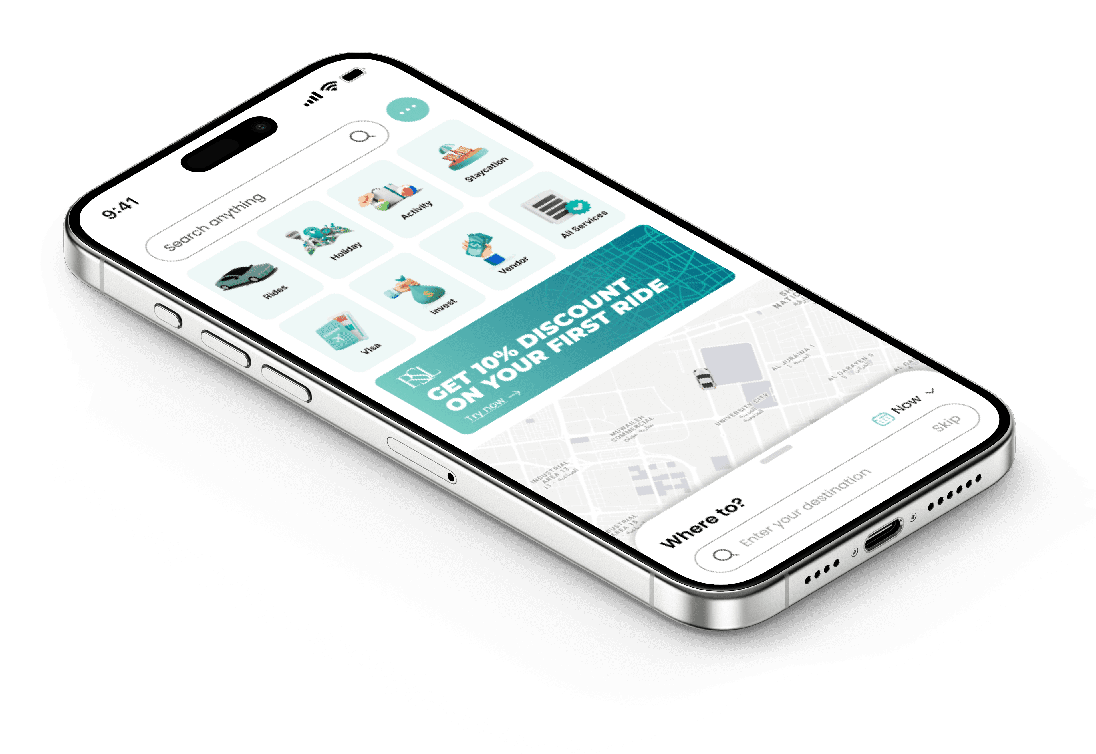
Ten services, one in use.
Discovery was the leak.
A year of event data showed the funnel thinning at every step. Only a third of users ever engaged with a product beyond rides.
- App users
- Reached the services section
- Opened one or more services
- Engaged with a product
What the reviews kept saying.
★☆☆☆☆“Very hard for booking.”
App store review
★☆☆☆☆“When you type your location, the search place just disappears.”
App store review
★☆☆☆☆“The fare says it’s going to be 30, ends up being 50.”
App store review
Store reviews, support escalations and user interviews pointed to four themes to design for:
Deciding what to build first.
I sorted every idea with MoSCoW, so the release focused on discovery and trust before anything nice-to-have.
Must have
- Quick, intuitive navigation
- Visible services & cross-selling
- Real-time driver tracking
- Transparent pricing
- Instant help & support
Should have
- Digital wallet
- Apple Pay / Google Pay
- Flexible booking
- Personalised picks
Could have
- Reviews & ratings
- Deals & rewards
- Offline pricing & T&Cs
Won’t have
- Multi-currency payments
- Native sign-up
Services first, map second.
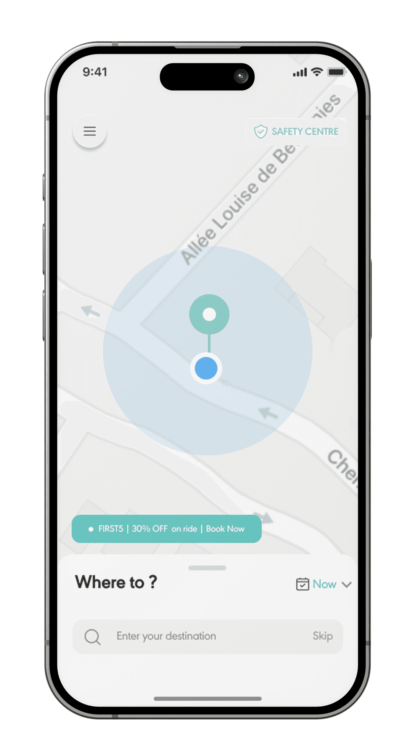
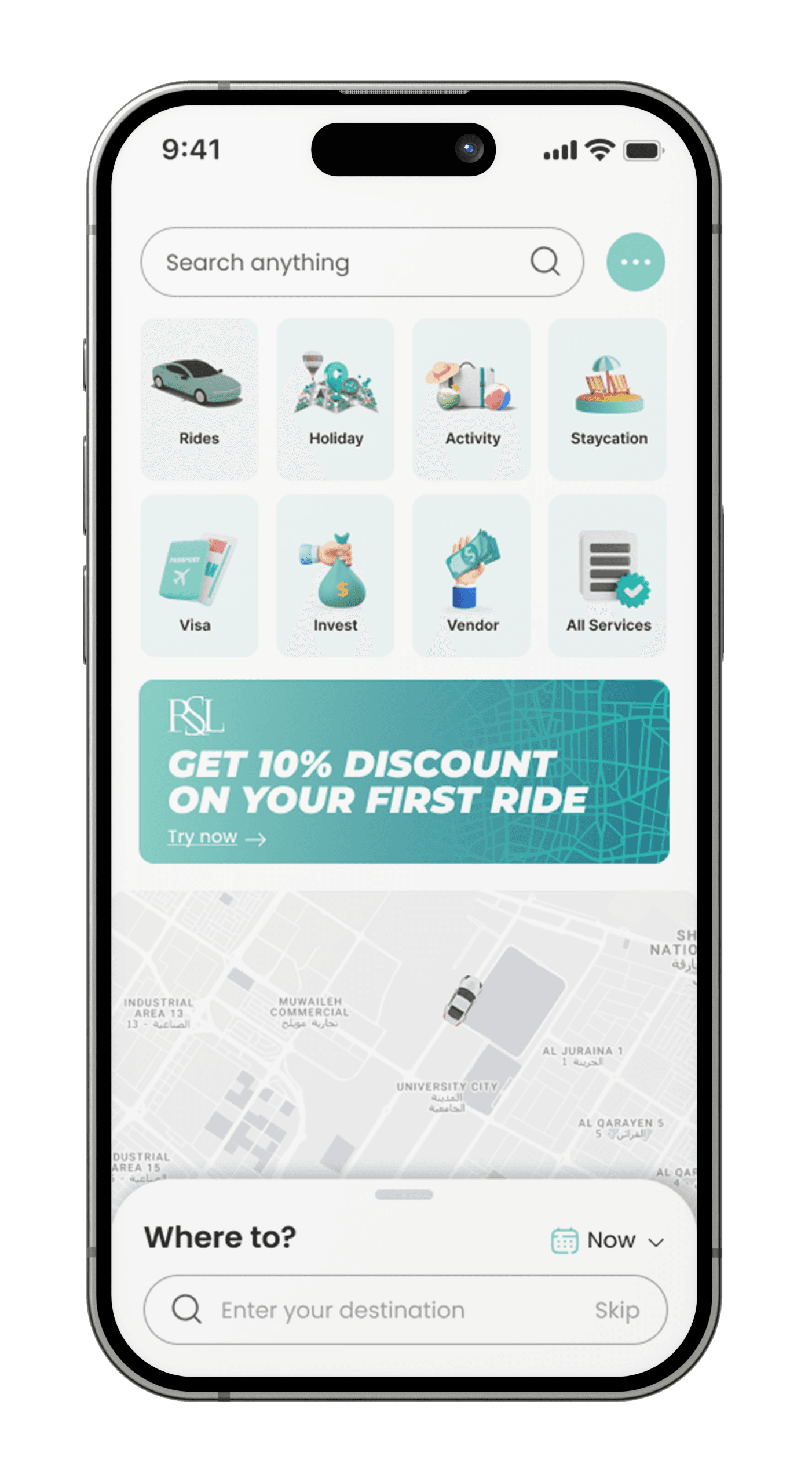
Rides and holidays, same rhythm.
Every service follows the same browse → choose → schedule → confirm pattern, so learning one booking means knowing them all.
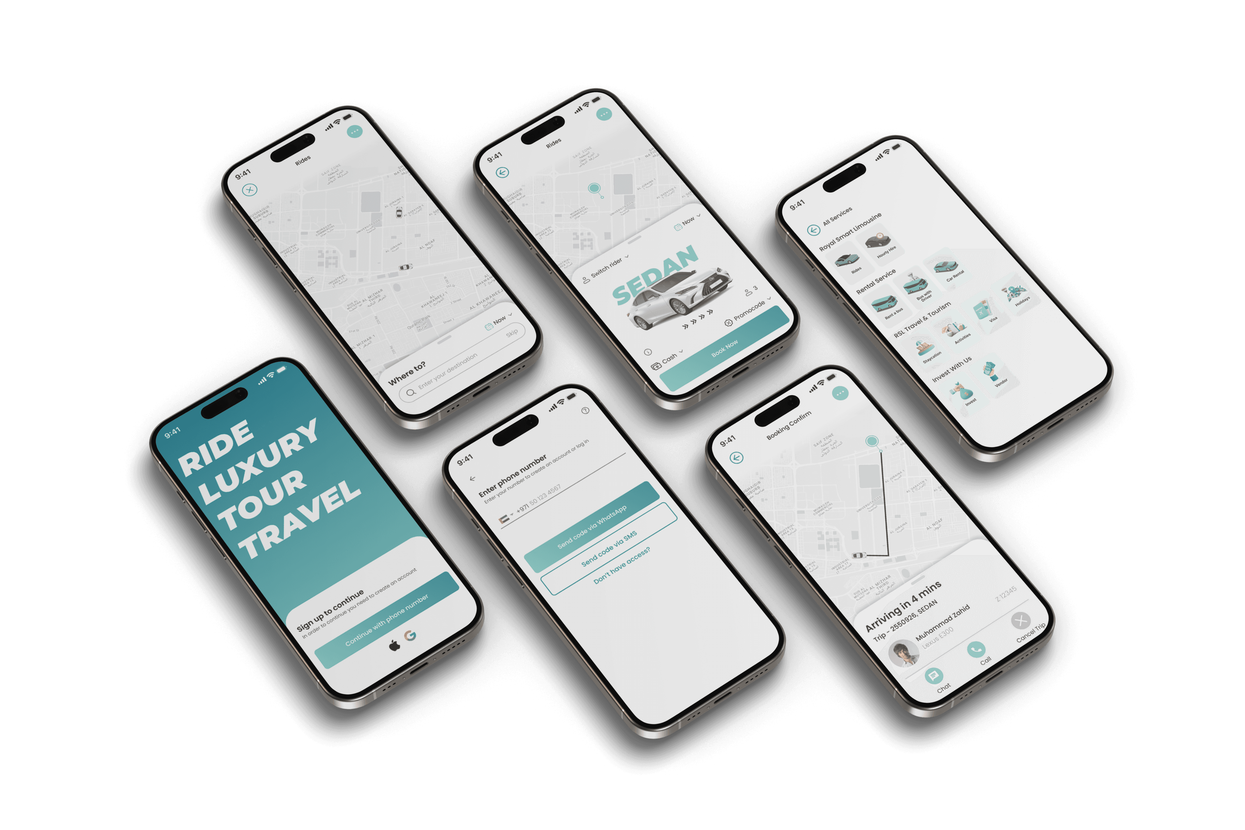
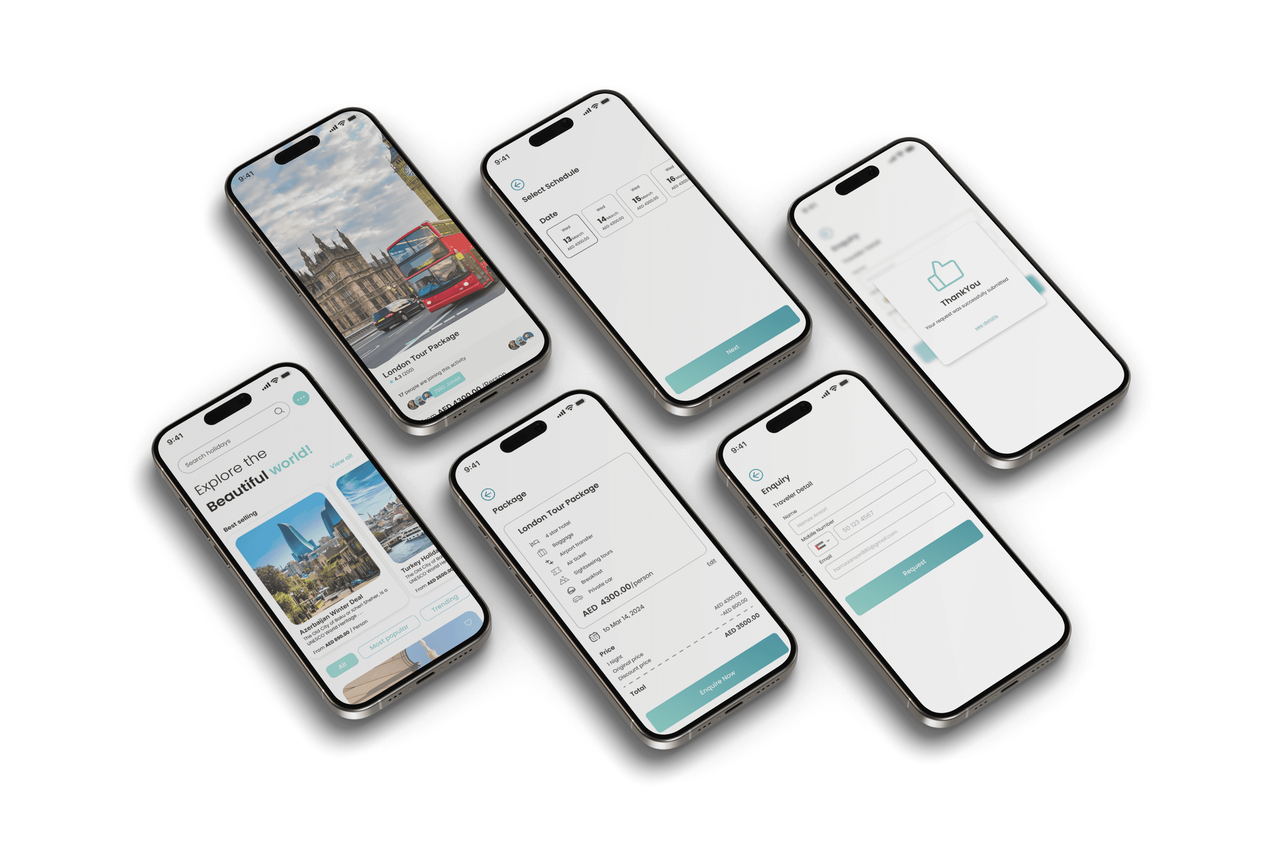
Rolled out to 30%, results in a quarter.
The redesign shipped to 30% of users from October to December 2023, compared against the nine months before.
Product engagement
Monthly active users decliningMonthly active users
Product engagement
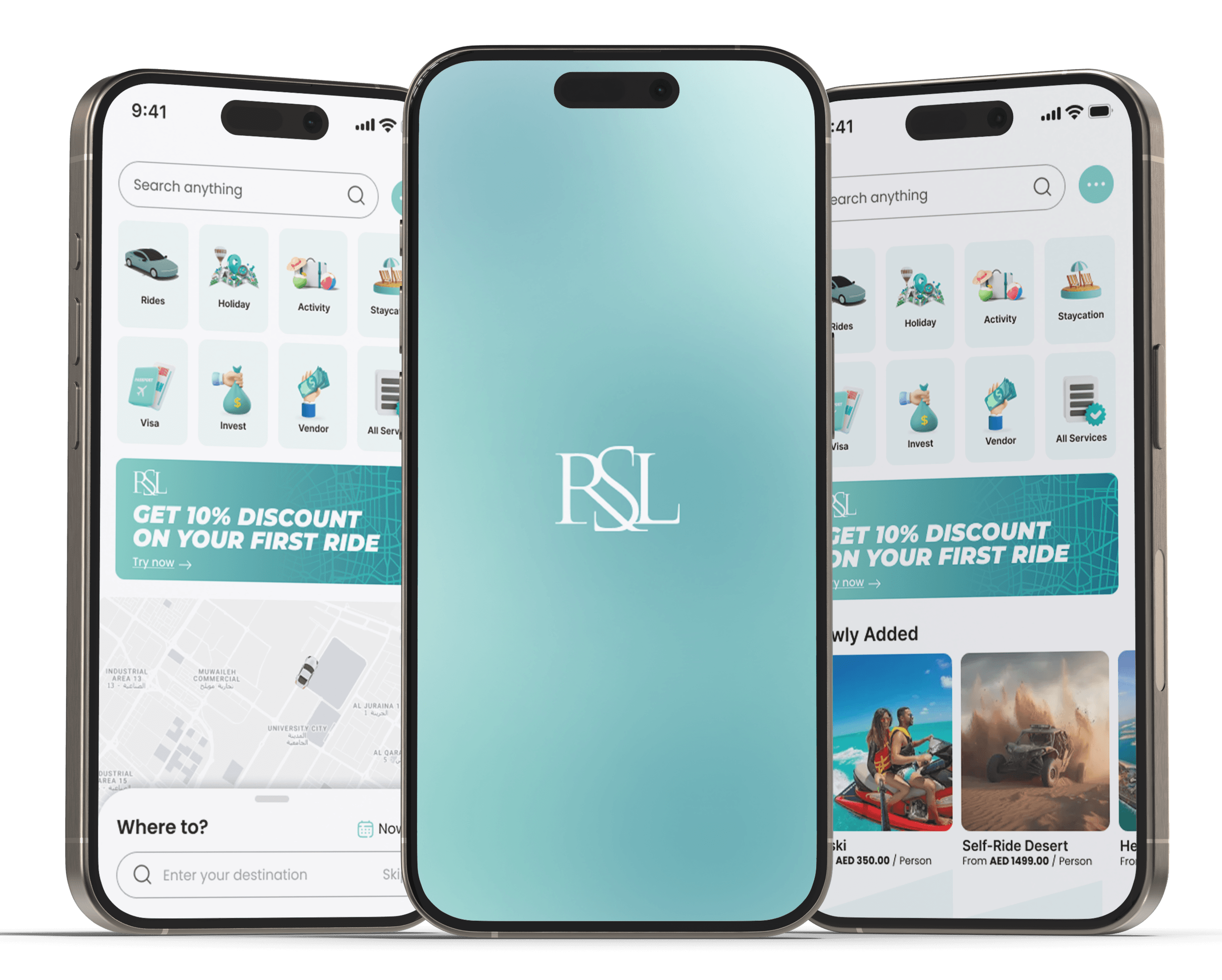
Take a ride through it.
Explore the redesigned super app yourself, from the home screen to booking your first ride.
Building something with AI?
Let’s design it right.
A short discovery call, no slides. Tell me what you’re building and I’ll show you how I’d shape the first version.